

Egyptian Stone Columns: The First Skeuomorphic Design in Human History?
Last updated 02/05/2024 ❖ First posted 02/05/2024
~8 minutes to read
The same design thinking that went into your app icons was around over 4,000 years ago. Here’s how.
Contents
What is Skeuomorphic Design?
Unless you’re a designer, you may not be immediately familiar with the term “Skeuomorphic Design.”1
This is a concept in user interface and product design where things (usually digital things these days) are made to resemble their real-world counterparts, either in how they look or how they’re used.
For example, a digital notepad app may have a graphical interface that looks like it has spiral wire at the top, blue lines, and a leather cover. Or take a calculator app that has raised-looking buttons and uses a display font for numbers. Even the “Recycle Bin” on your desktop can be thought of as skeuomorphic design.
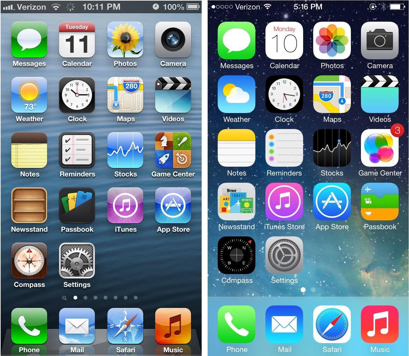
Skeuomorphic on the left, flat on the right.
The goal of these ideas is to make the products more easily understandable and intuitive. This is most important in the earliest days of new technology with new interfaces, which is why the old iPhone apps were so “realistic” in appearance. It helps bridge the gap.
Of course, once we’re familiar enough with the digital functionality, the common trend is to move away from these familiar trappings. Apple moved away from skeuomorphic design and into its current “flat” design in 2014, and it had the effect of making the apps seem less dated and “more futuristic.”2
The change let us stop thinking about apps as limited by the boundaries of their physical counterparts, and more about what they could be in digital freedom.
As an aside, yes, flat design does get very boring after a while, and I’m personally not the biggest fan. This is beyond the scope of this post, but check out material design3 and especially neumorphic design4,5 to see the cooler kids on the block. I’m a big fan of the both when used right.
Typeface Evolution as Skeuomorphism
A lot gets said about using the correct typefaces for the different types of design styles you choose.
Typefaces themselves, however, are another great example of skeuomorphism in action over millennia.
In the early days of writing, serifs on letters were caused by ink pens, and these serifs were so important to typography that when the first sans serif typefaces emerged, they were labelled “grotesque.”6

A grotesque typeface–obviously disgusting.
We call many typefaces “humanist”7 if they’re inspired by Roman lettering and the Carolingian miniscule8, which is something of the inspiration for lowercase handwriting today. These letters all have calligraphic roots, which come from the natural movement of the human hand as it writes. This is analogous to skeuomorphism.
A humanist typeface–which I would classify as skeuomorphic-analogous.
Thus, a Bauhaus font like Futura9, based on geometry, breaking down letters to their rational forms instead of how an old monk’s hand would operate, could be thought of as analogous to “flat design.”
This thinking isn’t particularly new or revolutionary, of course, but I can’t find much that looks at fonts specifically through the lens of flat v. skeuomorphic; however, that could just be because Google’s search engine algorithms are terrible these days. I may write an article one day expanding this thinking to material design & neumorphic design thinking in typefaces.
Egyptian Columns: Wood to Stone
Before, let’s say, around 2700 BCE, ancient Egyptians built shrines and mud huts using palm trunks and bundles of reeds for support.10
The thing about Egypt, though, is that it’s in a big old desert. Reeds and palm trees aren’t just out there growing on—well, they weren’t common, anyway.
Circa 2600 BCE, an architect named Imhotep used stone columns instead11. Stone was much more plentiful and had the added benefits of stability and endurance. You could support much larger, grander structures with stone for much longer periods of time.
However, Imhotep and the architects who followed didn’t just pile up stones. They carved them with designs that would make them seem familiar to the people using the buildings. You can probably see where this is going.
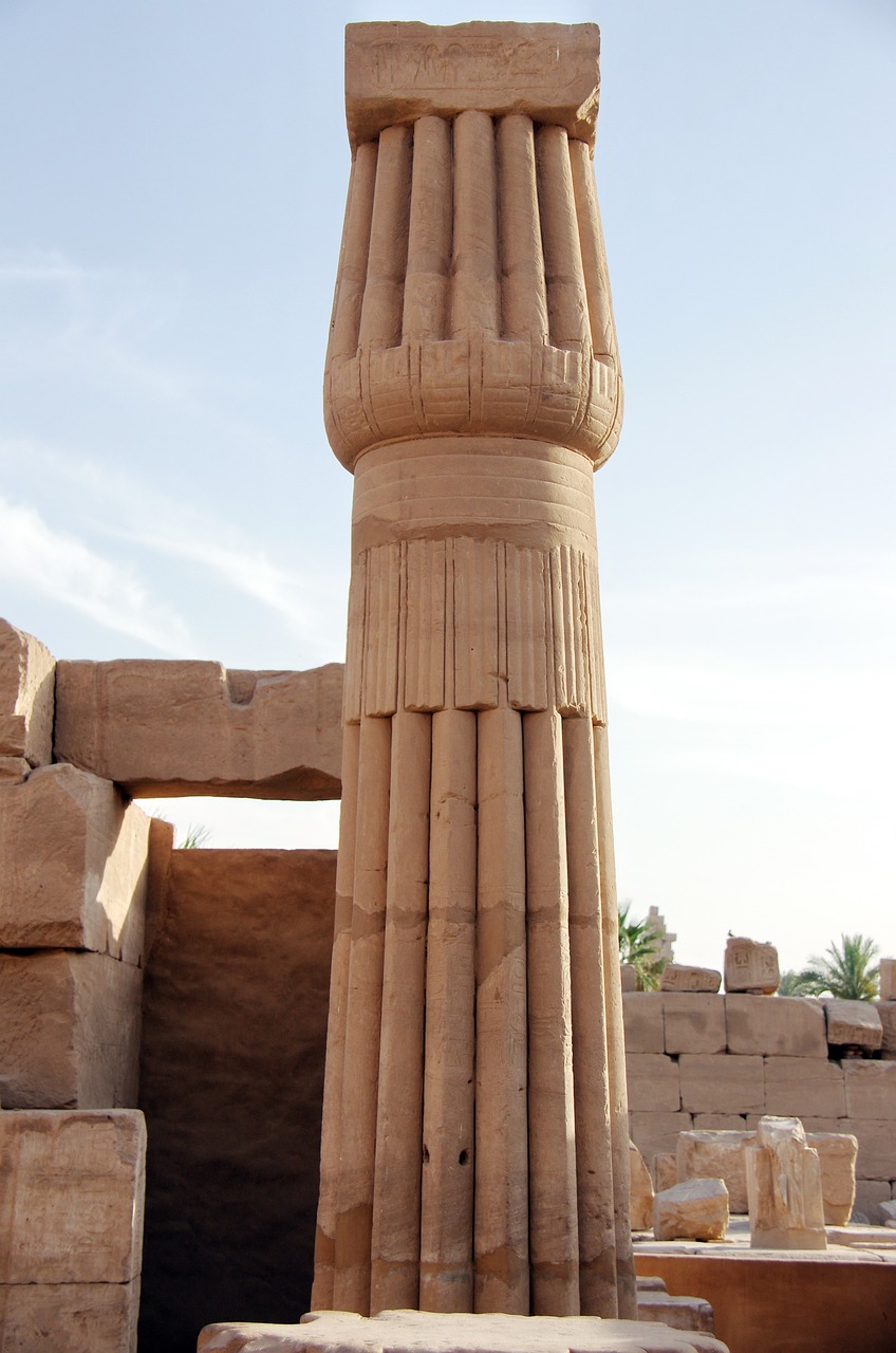
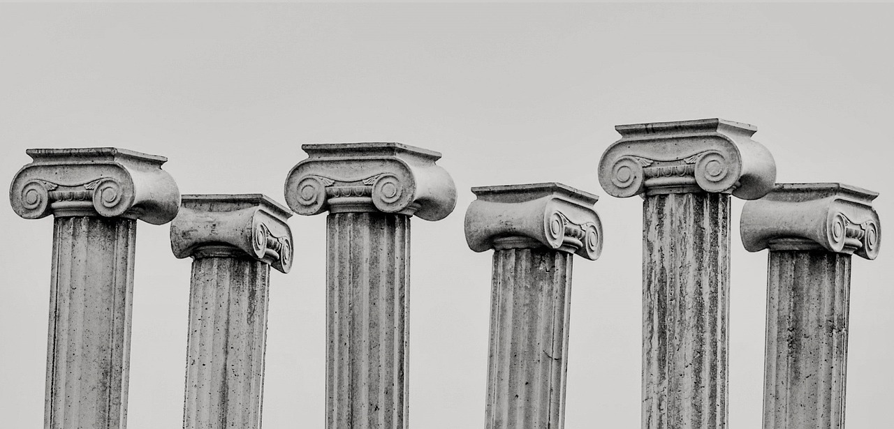
Vertical lines were carved to make these round columns seem like bundles of reeds. In Ancient Egypt, these lines made a column’s curves concave, not convex like the fluting we might think of today.
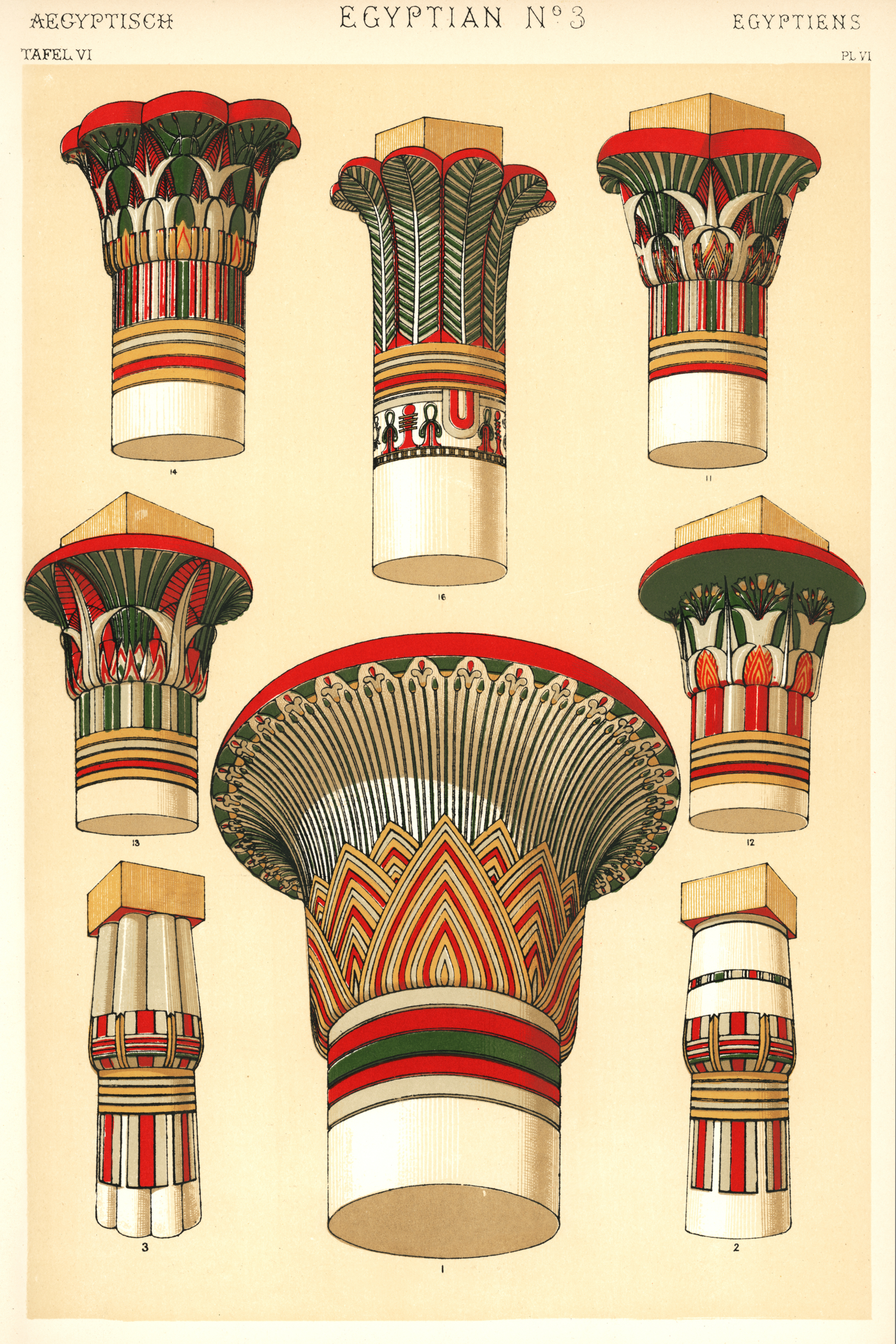
Capitals of columns (their tops) were also carved specifically to resemble palm leaves or the parts of other plants.
The most popular styles of Egyptian stone columns are lotus flower and papyrus flower12, showing their obvious connection to the natural world.
There’s even evidence that these columns were painted with greens, browns, and other natural colors to further mimic their organic roots.
This is what I believe to be the earliest example of skeuomorphic design in human history.
(I’m open to the idea that there could be something older in earlier civilizations, but I’d love to know what, if something comes to your mind.)
The exact same human instinct that made the first YouTube app icon look like a little analog television box was at work carving stone columns to look like reed bundles, four and a half thousand years ago.
In the following hundreds of years in Ancient Egypt, columns and their designs evolved and these original inspirations became more abstracted. The Greeks took them and ran with them, chiseling concave fluting, inventing Doric & Ionic orders for capitals and proportions, and onward and etcetera.
Again, the inspiration of columns is not news by any means, but the connection to skeuomorphism, and by way of that the connection to typeface design and so much more, is something that I can’t find written about previous to this.
Today, when we see columns in modern construction, we can imagine instead large bushels of branches and trees tied together, or massive bare trunks of wood. And then we can translate this directly to the designs on our phone screens.
Or at least, I can.
References
Skeuomorphic Design
1: Sketch.com: Complete Guide to Skeuomorphism
Flat Design
2: Interaction-Design.org: Introduction to Flat Design
Material Design
3: M2.Material.io: Introduction to Material Design
Neumorphic Design
4: Justinmind.com: Neumorphism
5: Hype4.academy: Neumorphism in User Interfaces
Typography
6: ZevenDesign.com: The Rise of Grotesque
7: ILoveTypography.com: Humanist Terminology
8: AdFontes.uzh.ch: Carolingian Miniscule, etc.
9: PaperbackDesign.com: Futura
Egypt
10: BuffaloAH.com: Egyptian Columns
11: FineHouse.net: History of Columns
12: MediaKron.bc.edu: Ancient Egypt
❖❖❖
Written by Ethan J. Hulbert.