




Ethan’s Expandable Accordion Designer Plugin
Part of my Free WordPress Plugins and Themes section.
v1.1.0
Every accordion plugin I’ve used picks one look and one behavior, and that’s what you get everywhere on the site. They’re also usually PAID PRODUCTS for such simple functionality. And half of ’em hide the content in ways that are awful for SEO and AEO/GEO.
I wanted a plain Q&A style for one FAQ page, something with a different icon and default state for a knowledge base, and a third look somewhere else, without installing three plugins or hacking one plugin’s CSS into pieces. This one is shortcode-driven, and the visual and behavioral settings live in named “types” you define once on a settings screen and reuse, or clone and adjust, as many times as you need.
And you edit the content in all of them on the page you’re working on, not in some separate obscure settings page. The settings page is only used for the styling.
As many looks as you need, defined once
Each type has its own default open or closed state, heading level, icon, animation, colors, width, and a raw Custom CSS field, all set from one settings screen. Make a “Simple FAQ” type, a “Plus/Minus” type, a stripped-down chevron type for a sidebar, whatever the site needs — they’re all independent, and a shortcode picks which one to use with a type="" attribute.
Built-out sample library
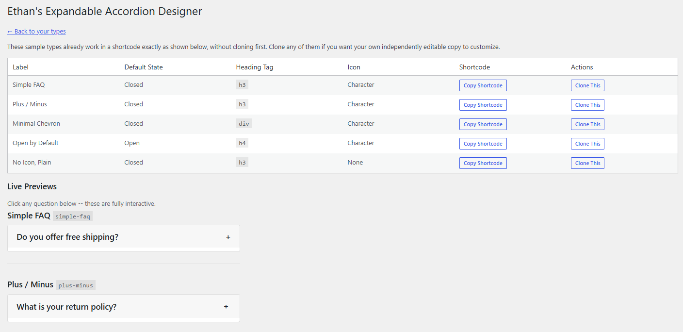
Eight sample types ship with the plugin, and they work in a shortcode immediately — type="plus-minus" renders right away, no cloning required first. Clone any of them if you want your own editable copy to build from instead of starting blank.
The shortcode wraps your content
The [trigger] bit is whatever stays visible even when the accordion is closed — a question, a heading, whatever. Everything after it, up to the closing tag, is the panel content, and it can hold pretty much anything a shortcode can: images, headings, other shortcodes, code blocks. The triggers can too! You have full freedom.
Each accordion is its own shortcode instance; for more than one on a page, use the shortcode more than once. They’re independent of each other.
Customizable heading levels every time
Set a type’s trigger to render as an H2, H3, any level down to H6, or a plain div with no heading semantics at all, and override that per instance with heading="h3" if one particular accordion on the page needs to sit at a different outline level. Styling is done entirely through a shared class, not the heading tag itself, so changing the heading level never changes what the trigger looks like.
This way if you have a page of FAQs where you need each question to be an H2, and a different page where you have H2 subheadings with questions underneath that need to be H3s, you can do it with total ease!
Icons that rotate, swap, or both
Pick a character, an uploaded image, or no icon at all, and set two independent toggles: rotate on open, and swap to a different icon on open. They combine freely — a plain rotating chevron, a plus that swaps to a minus, or an icon that changes glyph while it rotates, all at your choice. Rotate-and-swap together animates as one smooth motion, not two separate snaps. You can make some very neat effects with this.
The panel’s full content is real HTML on the page the whole time, whether an accordion is open or closed — nothing is added or withheld by JavaScript. The trigger is a genuine <button> with proper aria-expanded state, wrapped in whatever heading level you chose. If JavaScript fails to load for any reason, everything is still there to read; it just can’t be clicked open or shut anymore.
Deep link straight to one answer
Give an instance an id="", or use the one generated automatically, and linking to #that-id opens that specific accordion and scrolls to it when the page loads.
Full custom CSS
Every type’s wrapper carries a stable .eead-type-{slug} class. The Custom CSS field on each type is a plain CodeMirror box, and anything written there loads after the type’s generated styles, so a rule targeting that class wins. They are fully customizable, whatever you need on top of the basic template.
The settings screen has a Preview button per type that drops a live, clickable example below the table. The sample library shows every sample rendered and interactive, right there on the page. The type editor goes further: three live examples, stacked the way they’d actually sit on a real page, updating as you change any setting — one of the three uses a longer question and a two-paragraph answer, so you can see how the text wraps before you commit to a padding or line-height choice.
Where to find it
“Accordion Designer” sits in the main admin menu once the plugin’s active. Build or clone a type there, then drop into any post, page, or widget area that runs shortcodes.
Good to know
This is an original build, not a rework of anything else out there. If a type gets deleted while a shortcode still references it, that instance just stops rendering on the front end; logged-in administrators see a small notice explaining which slug is missing, so it’s easy to track down.
Finally, your search for a free accordion expand/collapse component plugin is over!
Please note that this is presented as-is with no warranty or support because I am just a guy online offering you free stuff. Refer back to the full disclaimer here.
If you find this useful I would love to know your thoughts and comments. If you are a commercial company with a large tool budget, if you want to insert this as a $200 line-item in your $50,000 expense request, I’d be grateful ’til the cows come home. But hey, I just hope you get some use out of it and I’d love a thank you email if you do. Contact me here.
Download Link
DOWNLOAD ETHAN’S EXPANDABLE ACCORDION DESIGNER PLUGIN
Have a nice day!