Pattern Description
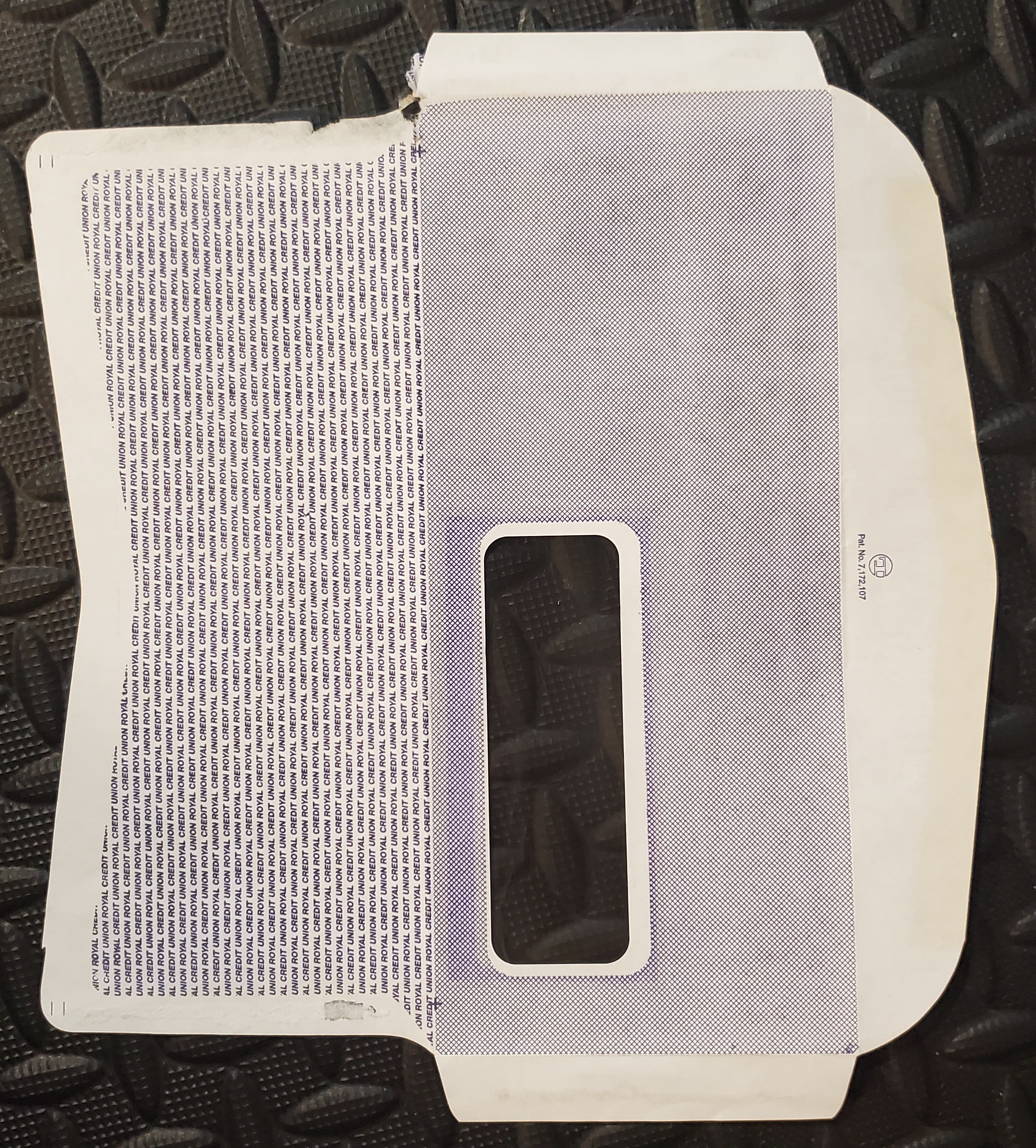
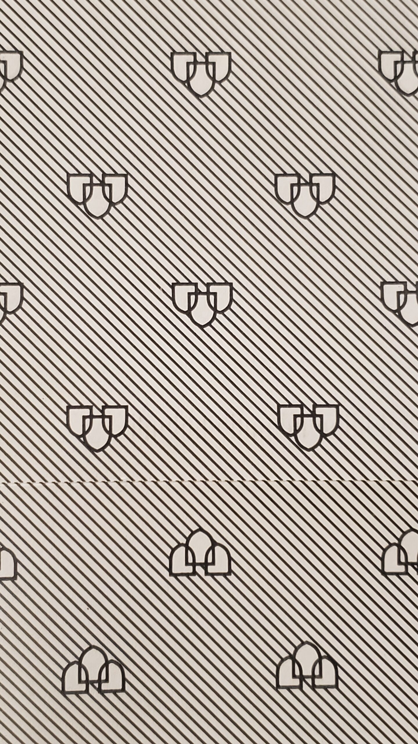
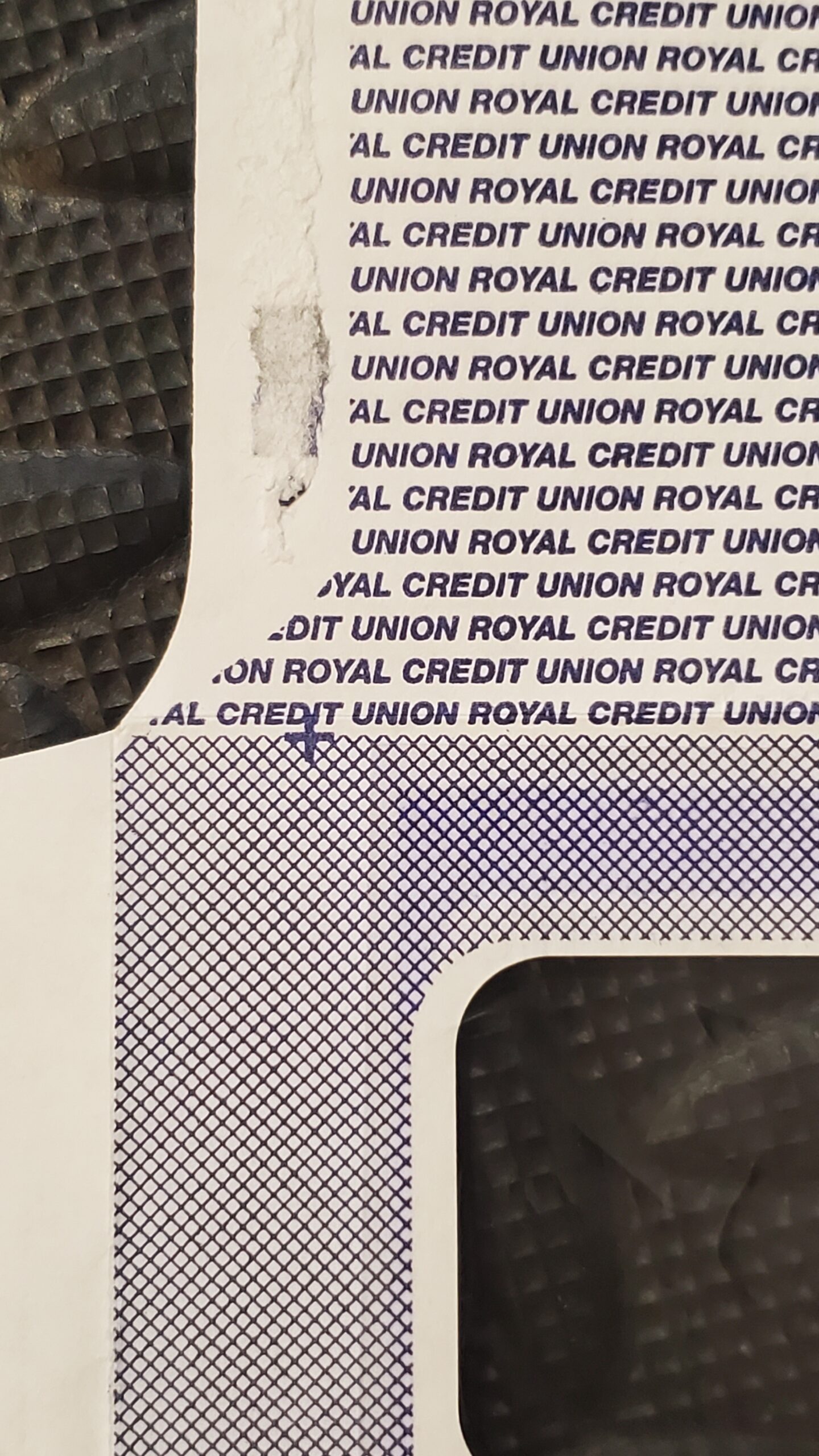
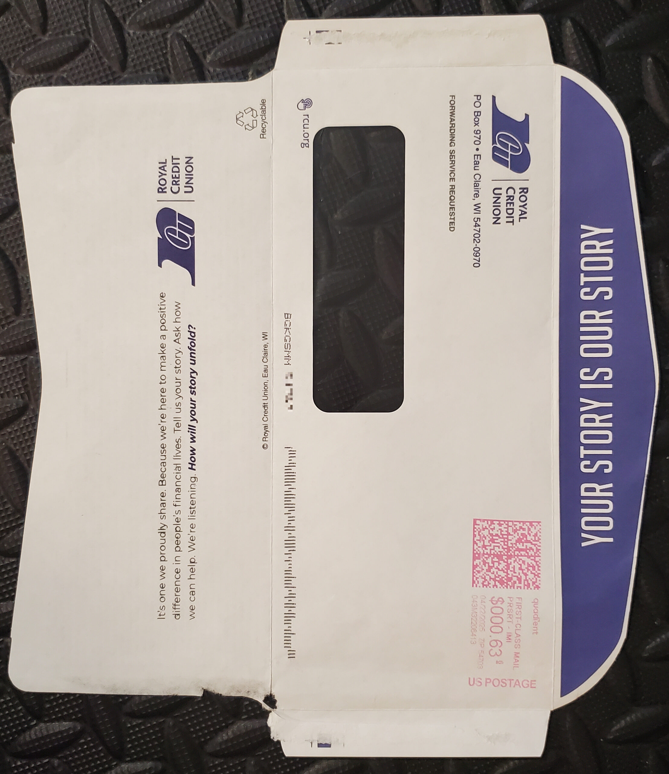
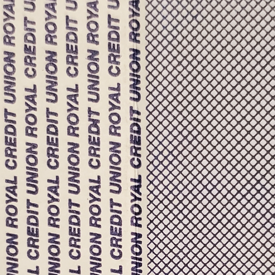
This envelope’s interior carries two distinct patterns, one on the front interior and one on the back interior, rather than just one. Even though both patterns are somewhat simple, this dual nature is in itself a rarity.
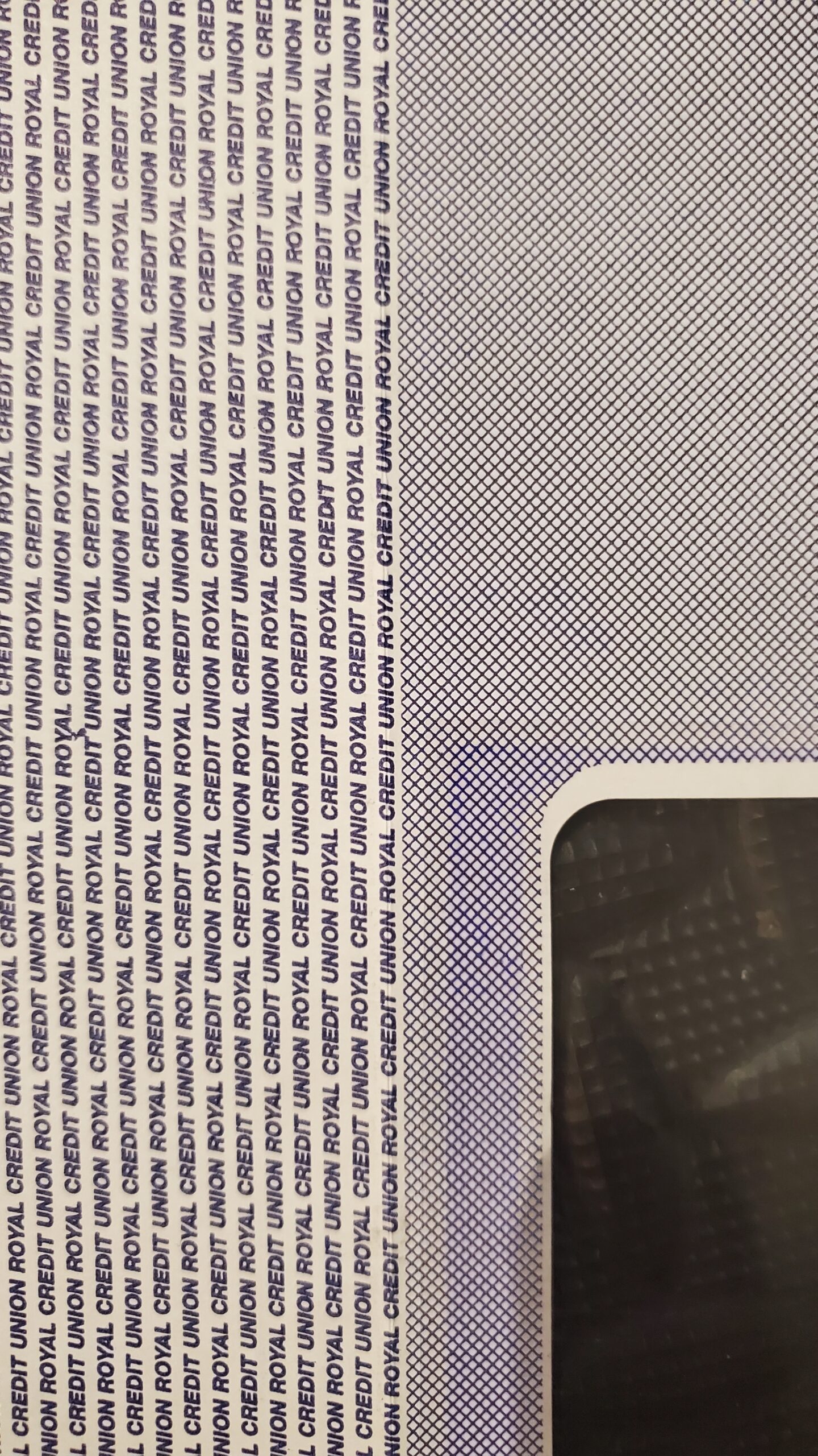
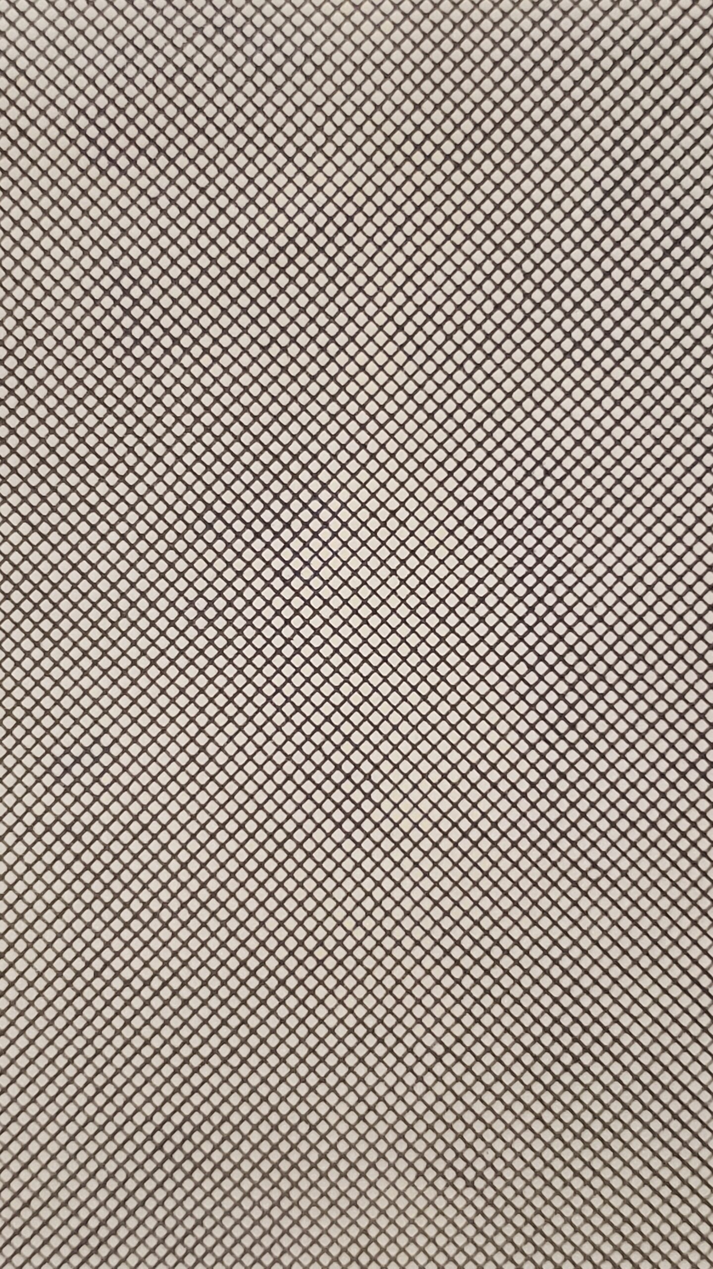
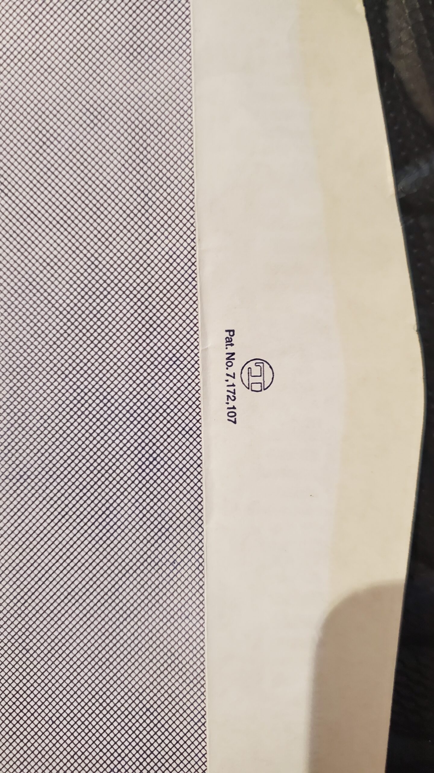
On the front side runs a plain diagonal grid, thin crossing lines forming a steady, even field of small diamonds with no variation in weight or spacing anywhere. It is essentially identical to the Fine Even Grid pattern.
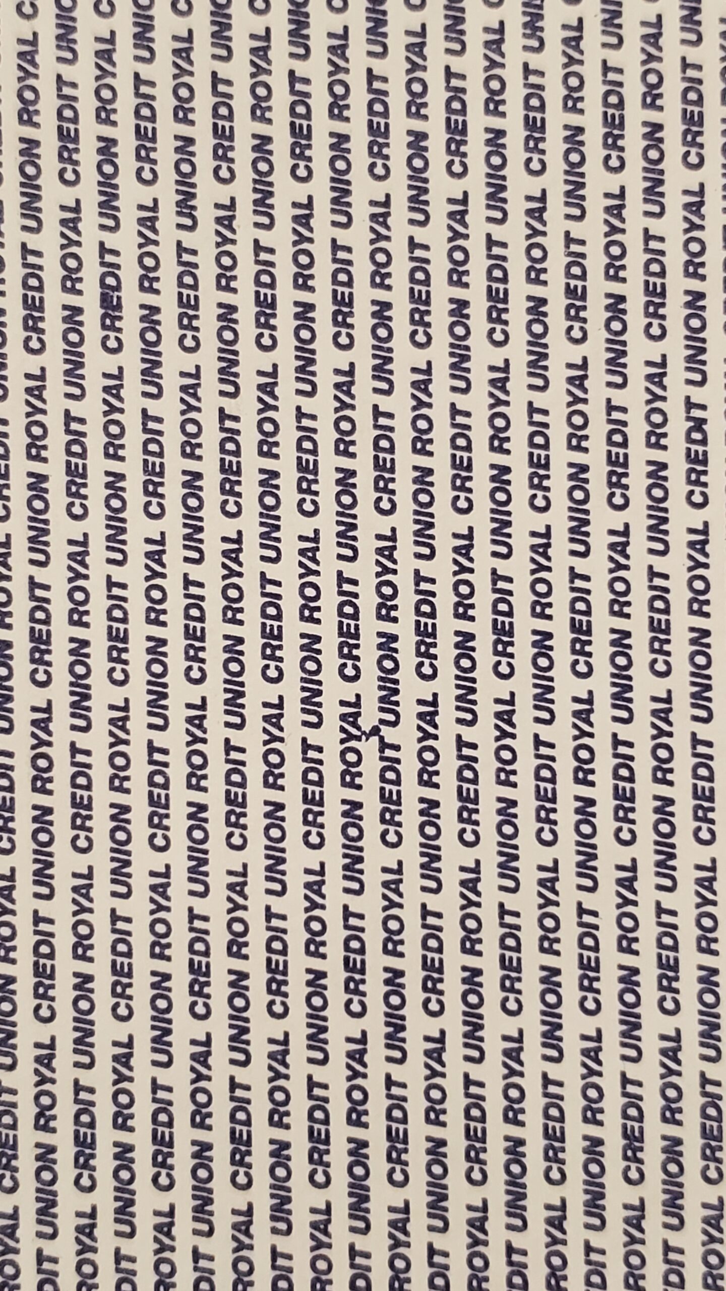
On the back side, the phrase “Royal Credit Union” repeats in tight, slanted all-caps rows down the length of the panel, with the starting point of the text staggered row to row so the words don’t stack into neat columns until the third layer. This envelope did indeed contain a letter from RCU, a financial institution.
Having two unrelated patterns paired together like this on a single envelope is unusual for this kind of print. The text side is the more interesting of the two, since it folds the credit union’s own branding directly into the security apparatus. Do you think having two patterns like this increases the overall security of the envelope?
Photo Gallery